Powerful Prototyping with Variables and Logic
Last summer, Figma introduced variables as a beta release, giving us designers a major leg up when building prototypes. However, it can still be hard to get a handle on just how to use these new features. While Figma has produced some good guides and a helpful playground file, I’d like to share a more practical example from a recent project.
As with any new feature in your favorite program, there’s going to be a trade-off between the time needed to learn it, and the time and effort saved by effectively building with that feature. In this case, we were able to test a design’s interactions that would’ve otherwise required a coded prototype, thus saving developers’ (very limited) time and getting user feedback even quicker.
✅ ProsMore accurate user testing: interfaces can respond much closer to user inputs Cleaner file: significant reduction in variants needed for complex prototypes Simple logic: setting of variables and conditional statements is stripped to the basics with no coding needed Well-integrated: integrates with existing prototype interactions and design parameters |
⚠️ ConsLearning curve: unfamiliarity with if… else… logic may require some trial & error Additional complexity: variables are used in prototype interactions, as well as on design parameters themselves Property conflicts: the same property cannot be affected by both a variable and a state management control Hidden layers: controlling layer visibility with variables hides elements while in design mode |
So what are we making?
We recently helped a client redesign a workflow for producing printed reports. To facilitate one particular user testing session, we needed a prototype with the ability to remove certain attributes of what was already shown on the page, and then reflect those changes in a subtle way on a report. In the past, we had a few options for this:
- quickly mock up a few static screens and run a less interactive user test
- spend the time to build an intricate Figma prototype, or
- ask an engineer to code up a realistic HTML prototype
None of these are ideal. Enter: variables. Now we have the option to create more realistic prototypes—with less effort than before and without inconveniencing our engineers!
This prototype, adapted from our user testing sessions, shows how someone would prepare a shipping manifest for printing. Their goal? To remove certain attributes of the packaging or labeling process from a list of packages to be shipped as per a customer’s request. The amount of attributes removed per package is then automatically reflected in the interface and on the manifest.
Workflow diagram

The final product
Check out the video below to get a sneak peak of what we'll be making in this article, or play around with it yourself in the Figma file.
A simpler world with variables
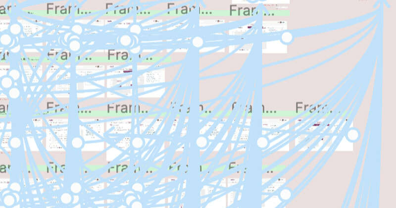
Remember making prototypes that looked like… this? Spaghetti connections everywhere?
Well for this prototype, all we need is a single screen and a few components! In fact, all logic and almost all interactions are set within the components themselves. One unfortunate consequence of variables still being in beta (as of Jan. 2024) however is that in order to affect different variables in different lists of things built from the same components, the components need to be duplicated. (if there’s a better way to do this, please reach out—we’d love to update this article!)


Before starting our variables journey, we’ll wire up a few basic prototype connections, namely checking/unchecking the checkbox, and expanding/collapsing the package component. Feel free to make a copy of the design file at this point, and follow along with the rest of the article!
Prep the variables

If you have any experience with programming, you know that before using any variables, they must be defined. And before we define them, we should probably figure out just which ones we need. To do that, let’s list the things we want to accomplish:
-
In the sidebar, show how many attributes have been removed from each package in real time as they are being unchecked/rechecked
-
On the manifest, anywhere a package with attributes removed is mentioned, append a *
-
In the footer of the manifest, add an additional line of text explaining the meaning of the * if any package has had attributes removed
-
In the footer of the manifest, show the amount and which attributes were removed from which package (will require some fakery to reduce complexity)
To do the above, we’ll need the following five variables:

edited-ANY: tracks if any attribute from either of the two packages has been removed—this allows us to show general messages/alerts without needing to check both A & B
edited-A: tracks if any attributes have been removed from Package A
edited-B: same as above, but for Package B
edit-count-A: tracks how many attributes are removed from Package A
edit-count-B: same as above, but for Package B
Building the basic logic
Uncheck the box

The most complex interactions to set up will be the checkboxes. So let’s do those first! We’ll start with the checked variant, since all boxes start off checked, and set them up with the “A” variables (later, when duplicating components for Package B, we’ll swap in the “B” variables).
A few different things are happening, so let’s break it down.
-
Increment the
edit-count-Avariable by 1 to reflect that one attribute has been removed from Package A -
Set the
edited-Avariable to true, indicating that at least one attribute is removed from Package A (ideally we’d check to see if this variable is already true, since it only needs to be set when first incrementing from 0 to 1, but this keeps it simpler) -
Set the
edited-ANYvariable to true, indicating that at least one attribute is removed from either package (with the same caveat as above) -
Change the state of the variant from the checked to the unchecked state
Re-check the box
Returning the checkbox to its original state isn't as simple as just doing the opposite. Here we need to add our first conditional statements.

-
Decrement the
edit-count-Avariable by 1 to reflect that one attribute has been added back to Package A -
After decrementing, check to see if all previously unchecked boxes in Package A have been re-checked
-
If so, set
edited-Ato false—the list of attributes in Package A is now back to its original state -
Otherwise,
edited-Aremains true
-
-
Check to see if all previously unchecked boxes in both packages have been re-checked
-
If so, set
edited-ANYto false—the entire prototype is now back to its original state -
Otherwise,
edited-ANYremains true
-
-
Change the state of the variant back to checked
With these checkbox interactions set up, the bulk of the logic is already done! Variables are in place, and checking and unchecking boxes in the prototype is already setting and resetting values. Now we just need to apply those variables to components that will reflect changes in the UI. But first…
Duplicating components for Package B
As mentioned earlier, in order to track two sets of attributes separately, we need to duplicate the following components and rename them as such:
A-checkbox	→	B-checkbox
A-attributes	→	B-attributes
A-list		→	B-list
A-package	→	B-package
A-name		→	B-name
Once duplicated, open the prototype interactions for B-checkbox and swap the variable and conditional statements to edit-count-B and edited-B. However, the last statement for each variant (setting and resetting the edited-ANY variable) doesn't need to change, since that’s already checking both variables.

In order for the two lists of attributes to behave independently, we also need to swap the following nested components from their A-variants to B-variants:
-
Select each of the three checkboxes within B-attribute variants and swap the component from A-checkbox to B-checkbox
-
Select each instance of A-attributes within the B-list component and swap them all to B-attributes
-
Select the A-list component within B-package and swap it to B-list
With all components for Package B set up, let’s move over to the design itself. Select the second instance of A-name in each of the 3 locations and swap to its B-name variant.

Then, select the second package in the sidebar and swap to its B-package variant et voilà: two independently-functioning, variable-powered lists!

Let’s see some results!
It’s time to start seeing the power of the variables we just set up! To do so, we'll need to assign variables to various parameters, so we're sticking in design mode for the rest of the article.
Show edit counts
First up, let’s reflect how many attributes are removed from each list. Select the “#” text boxes on each variant of A-package, then click on the hexagonal variables icon in the text panel. Since we’re choosing a variable to replace a piece of text, only the two text variables are shown here. Select edit-count-A and you should already see the “#” change to “0”, since that’s the default value of the variable. It’s working!

Hide parenthetical text until attributes are actually removed
To keep the interface clean, we’ll hide the “(0 removed)” text until at least one attribute within the package has been removed. To do this, select the whole frame for both variants and right-click the eyeball icon on the layers panel. Here, we only see the three boolean variables, so select the edited-A variable for both variants of Package A, and then, repeating the same steps above, the edited-B variable for Package B.

Both frames should immediately disappear since the variable is set to false by default, but if we preview the prototype, expanding a package and removing an attribute makes the frame reappear. Removing more increments the number—and each package increments independently! Think about how many frames we’d need if we tried to build this without variables!
Updating the manifest
Adding the asterisks
We’re almost there! Taking a look at the manifest, since we’re showing package names in a few different places, we don’t want to list the removed attributes each time. Instead, we’ll add an asterisk by the name of any package with removed attributes and show the full list in the page’s footer.
Select the “*” text box next to the A-name master component, right-click the layer eyeball, and choose edited-A. Do the same for the B-name master, selecting edited-B instead, and both asterisks should disappear.

Making the footer dynamic
Finally, the footer. And unfortunately, this is one place where the power of Figma’s simple application of variables does break down a little. Since we’re only tracking the number of attributes removed from each package, and not their names, we can’t show a list of attributes here as the design intends. Instead, we’ll use some placeholder copy to indicate the actual list.
At the very least, we can show the amount of attributes removed in the same way as in the sidebar. Simply repeat the process used there—setting the “#” text boxes to their corresponding variables—and then tie the whole frame’s layer visibility to the corresponding edited-A or edited-B variable.


Lastly, select the frame containing the title and the two now-hidden frames and set its layer visibility to edited-ANY. This ensures that as soon as an attribute is removed from either of the packages, this section title will show up above whichever package is detailed below.

So, how did it go?

With just 5 variables, we’ve avoided the typical mess of interconnected and duplicated screens of Figma prototypes of the past. While variable logic does add an additional layer of abstraction to prototype interactions and component properties, it allows for much more realistic prototypes—well worth the investment in our design process!
Compared to the weeks we would've waited for an engineer to find time to code an HTML prototype, we saved an enormous amount of time by using variables. Between other design tasks, it took about 3 days to put this together, getting us from conception to user testing sessions in under a week.
Specific feedback during the sessions showed that the immediate feedback after removing attributes was exactly what was envisioned—something only possible with variables. Another user brought up including additional attributes in the lists. With the variable logic concentrated in the checkbox component, we easily brought their idea to life in a few seconds by simply adding a few more attributes to each list component.
A proper application of variables such as this allowed us to enhance our existing prototyping workflow rather than requiring an overhaul. While exploring these new features and techniques, remember: variables are still in beta and development is ongoing. So stay curious and be ready to adapt to the evolving landscape of prototyping!
Continue the conversation.
Lab Zero is a San Francisco-based product team helping startups and Fortune 100 companies build flexible, modern, and secure solutions.
