Impressions of the UX Week Mobile App
We are back from UX Week 2016 and we really enjoyed the conference. Our hosts Adaptive Path offered an app for attendees, and we thought we’d share some impressions from using it at this year's conference. Most of our team in attendance use iOS devices, but the experience seems similar with the Android and Web interfaces.
The UX Week app appears to be based on a turnkey conference app from DoubleDutch. Given the focus and audience of the conference we hoped for something more fine-tuned for UX professionals, but we know how costly it can be to build custom mobile apps and it has been useful to us. With that in mind, let’s review a few of the main pages:
Default View & News Feed Page

The opening view is a much like Facebook when you sign in: the app shows posts from attendees in a news feed listing. Attendees can post pictures of what they’re currently working on or learning.
It’s interesting to do a quick scroll through these, but a few questions arise: why have a separate social outlet in this app when many of us already share posts on Instagram and Twitter? It makes sense to have a private channel for the conference, but is the juicy content here or on a different social media site?
We missed having a prominent Schedule button on the homepage, since the schedule is what we need to refer to most often. Currently, it’s hidden in the hamburger menu.
Submitting a Post
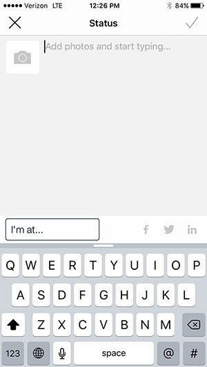
Communication and shared learning is definitely important at this conference, so we like that there’s a clear Post call to action on the homepage. It’s helpful that the design on the Create Post page is similar to Facebook’s — it’s a familiar interface you already know how to use.
Nav Menu
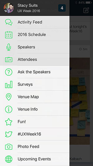
The top four items in the nav menu are highlighted, and they’re appropriately chosen. When you start scrolling through these, the top items stay static, so you can still see them, which is a nice feature.
Once you click a link and navigate to the selected view, there’s not an obvious way to get back to the default view — you have to click into the nav menu and click ‘Activity Feed’.
Ask the Speakers
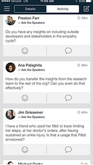
After the speakers’ presentations, the host reads questions that attendees have asked through the app. There is a separate view to post these questions and a separate news feed view of these questions (you can also see them in the main news feed with the “Ask the Speakers” tag). This is handy because it gives you a direct point of access to these questions; saving the time of searching through the main news feed for them.
Schedule Page

The Schedule page is the most useful view to our teammates in attendance. It contains the agenda of the keynotes, talks, and workshops, which are listed chronologically. The current date shows up first. You can swipe to past or future days to see their agendas. Items are grayed out if they’ve already happened, which makes it easier to quickly see what’s done, current, or upcoming. Standard fare and pretty clear.
The My Agenda view falls somewhat short. We expect to see our personal workshop schedule here. Instead, users have to manually add your events from the Agenda tab, by finding them and then clicking the item’s calendar icon. This was our biggest wish and the feature that would delight us.
In Summary
The app is useful for checking on what’s up next on the schedule or taking a quick peek at the news feeds. At the top of our wish list for next year, we’d like to see an improved schedule design, and perhaps replace, or augment, the current news feed with a Twitter feed of the conference hashtag.
Continue the conversation.
Lab Zero is a San Francisco-based product team helping startups and Fortune 100 companies build flexible, modern, and secure solutions.
