Three practical tips to advocate for web accessibility
Most people cannot imagine life without the Internet. Can you also imagine being the only person without access while the world carries on without you? I don’t know about you, but I’d give up a lot of other things before giving up access to the Internet.
Recently, web accessibility specialist at the University of California, Berkeley, Anna Gazdowicz, spoke with me about effective ways designers and developers can be more practical web accessibility advocates.
“Accessibility is contagious,” explained Gazdowicz. “Once you learn a few basic concepts about making the web more accessible, there’s ‘no going back’ because good design principles go hand in hand with designing and developing a web-accessible site.”
At this point, I neither considered myself an accessibility expert nor had I gone out of my way to learn more. Who defines accessibility requirements, anyway? I needed to get beyond the mindset of “web accessibility is important” and instead learn the basics to design better web products with vision, hearing, or motor skill disabilities in mind.
People easily agree that designers and developers should strive for web accessibility, but what can we do right now to be more practical advocates for accessibility? Here are three easy tips to try today on any website project to become a better advocate for web accessibility:
-
Learn how screen readers work by viewing a demo
-
Test your website for color contrast
- Navigate a website without a mouse and by keyboard only
Tip #1: Learn how screen readers work
Let’s dive in by viewing this screen reader demo, which was produced by the University of California, San Francisco digital accessibility team. The demo requires sound and lasts just under five minutes.

Marc Sutton, screen reader specialist, shows how blind people access the Internet and screen reader technologies with a keyboard, instead of a mouse.
Screen readers are a great place to start because people often think first about blind people when considering accessibility issues. In this demo, Marc Sutton shows how screen readers convert what is displayed on a computer screen into information that can be displayed through synthetic speech or braille output. He quickly points out how websites lacking intuitive navigation or properly coded HTML tags can quickly cause issues for screen reader users like himself.
Did you know most computers and smartphones come with screen readers built in? Try it for yourself by accessing your screen reader with either the iPhone’s VoiceOver or the Android’s TalkBack features on your phone, or try Google’s ChromeVox for desktop.
Tip #2: Test your website for color contrast
Another effective tip that any designer or developer can try today is evaluating the amount of color contrast on a website. Provided by a web accessibility blog called Web Axe, choose from one of the many online tools here to see if your website has enough color contrast. I recommend using WebAIM’s color contrast checker.
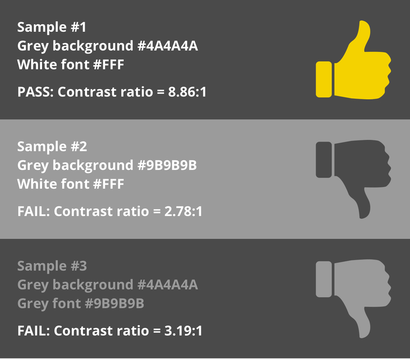
Using the WebAIM color contrast checker, here are three sample color combinations and the resulting PASS or FAIL assessment.
Color contrast is important because many users, such as people with low vision or the elderly, have a difficult time distinguishing colors. If the font color is too similar to the background color of a website, users might miss the content altogether.
The Web does not have an equivalent law like the Americans with Disabilities Act of 1990, meaning designers and developers are not obligated by law to feature colors with a certain amount of color contrast. That said, there are many guides that specify “design-ready” standards, including Section 508 and the Web Content Accessibility Guidelines 2.0 (WCAG). WCAG suggests that the contrast ratio between text and its background should be at least 4.5 to 1.
In addition to color contrast, it’s also very important to design with color blindness in mind. An accessibility specialist at Salesforce, Jesse Hausler, cites in his accessibility-themed blog post that 1 in 12 men and 1 in 200 women are color blind, 1 in 30 people have low vision, and 1 in 188 people are blind altogether.
The cover photo used for this blog post features colors that fade from green in the top-left corner to red in the bottom-right. For those not suffering from any level of color vision deficiency, check out a color blindness simulator, such as Coblis, to see how an image is seen by red, green, blue, or completely colorblind people. By testing the cover photo used for this blog, we learn that the colors chosen are not accessible to large numbers of people. Hence it is best practice to avoid using only color to convey meaning to people on your website.

Color blindness simulators, such as Coblis, show how a “red-blind” person would view this blog post’s cover photo, which features inaccessible bright green and red colors.
Tip #3: Ditch your mouse and see whether you can navigate your website by keyboard

“People often think of blind people who use a screen reader first, but accessibility is broader than that. Accessibility includes anyone who has trouble using a mouse. If a website works well using a keyboard, chances are it works pretty well in general from an accessibility standpoint.” - Anna Gazdowicz
A final tip to try today involves ditching your mouse or trackpad to view a website on your desktop. Are you able to use the keyboard alone to navigate a website? Are you able to tab through the navigation bar? Are there any hover effects or drop down menus that you find hard to access?
Gazdowicz pointed out that accessibility pertains to any person who has trouble using a mouse on a desktop to navigate a website. Blind users cannot see a mouse on the screen, so instead use screen readers, which work by using the keyboard. People with fine motor skill issues, a broken arm, or those missing an arm and hand altogether also cannot use a mouse, and hence use the keyboard and/or use speech input features. Users with carpal tunnel might incur pain when trying to use a mouse, so they are also included in accessibility considerations.
An accessibility audit for this blog post
To demonstrate the three tips above, let’s take a minute to audit this blog post:
-
Screen reader: Proper HTML tags are used for this site’s navigation, headers, paragraphs, ordered lists, links, and buttons, etc., making this blog accessible and properly formatted for screen readers. If a screen reader user were to use the “links” or “buttons” shortcut, they will be pleased to find the correct content listed on each shortcut, helping them navigate this blog post faster.
-
Color contrast: Using WebAIM, Lab Zero uses a dark grey foreground color, #252525, and a white background, #FFF, which has a contrast ratio of 15.33:1, which satisfies the recommended color contrast ratio of 4.5:1.
-
Keyboard navigation: I am also able to successfully navigate the blog page by using a combination of the Tab, Enter, Shift+Tab, and arrow keys.
This basic audit only took a minute to be mindful of common accessibility pitfalls. Whether you are a designer or a developer, please give these three tips a try on your own website or project so that you too can be a more practical advocate for web accessibility. While I did not test this blog post with a web based screen reader, I did view the site on my iPhone using a gesture-based screen reader for iOS called VoiceOver. It was fascinating to hear my iPhone read this blog post to back to me over the phone’s speakers.
It is my hope, thanks to the tips from Gazdowicz and other resources, that the Lab Zero blog is accessible and properly formatted for screen readers and other assistive technologies.
Accessibility is not a constraint
“There’s a myth that accessibility constraints will negatively affect a website,” said Gazdowicz. In reality, designing and developing a website to be web accessible goes hand in hand with building a website with best practices and usability in mind. Gazdowicz reiterated that “if a designer or developer follows best practices, generally speaking the website will also perform well from an accessibility standpoint.”
A product specialist at Lab Zero, Aaron Cripps, has seen firsthand from client experience that “planning ahead for thorough accessibility might cost up to 10% more upfront, but saves our clients more in the long run.” Cripps finds that “the cost of retroactively updating a website for accessibility is unpredictable and is likely to significantly exceed the upfront investment.”
At Lab Zero, we strongly believe that web accessibility is worth the effort. Lab Zero founder, Dean Baker, says that “there is a myth that, unless required by law or specific user type, accessibility is ‘not worth the effort’.” Just like building codes in the US are required by law for physical structures, we think designers and developers should ensure websites are accessible for everyone on the Internet, as well.
We are proud to advocate for accessibility best practices and view it as a responsibility when approaching any project, especially for internal products and applications built for our clients. We hope you find the three tips above and resources helpful so that you too are empowered to advocate for web accessibility.
Additional resources
Looking for more? Try these resources below or search #a11y on Twitter.
Continue the conversation.
Lab Zero is a San Francisco-based product team helping startups and Fortune 100 companies build flexible, modern, and secure solutions.
